
Using Social Network Analysis to Predict High Potential
Summary
- The aim of this project was to conduct a fail-fast experiment into people analytics using Social Network Analysis (SNA).
- SNA outputs plus other HR data were used to predict client determined High Potential (HiPo) status:
- Machine Learning models were consistently accurate at correctly identifying NON HiPo’s.
- The same models were inconsistent and less accurate at identifying HiPo’s.
- SNA shows promise and has a variety of additional use cases, for example:
- Identifying useful patterns that separate groups on their level of safety risk.
- Identifying well-connected individuals to target as change champions.
- SNA requires substantial investment to:
- Establish a suitable amount of data that can be ‘refreshed’ over time.
- Create a predictive model that can be implemented with minimal human involvement.
- Advances in explainable AI, allow more complex (and generally accurate) models to be inspected and potentially used for high-stakes decisions.
Context
- The client – a large mining company – was interested in running a fast-fail style of experiment into people analytics.
- The data already existing from a previous project and consisted of four months of email and meeting data for four departments.
- Only the TO and FROM fields were available for emails, along with information regarding each employee. Said differently, the subject line and content from within each email or meeting invitation was NOT included in the data set.
- Given the type of data available, Social Network Analysis was used to explore if there were meaningful patterns in the data that had a link with important business outcomes.
Social Network Analysis Primer
- Social Network Analysis or SNA for short, is a technique to visually explore social structures or things, for example:
- How a disease spreads,
- What products are purchased together,
- Which stations people get on and off as part of their commute,
- How business networks share information (vs. the theoretical organisational chart)
- SNA produces several network level and person level metrics that can be useful, for instance:
- The number of connections needed to cross a network (think 6 degrees of separation)
- Identifying structural holes or gaps in the network
- Determining a person’s centrality or potential importance within the network
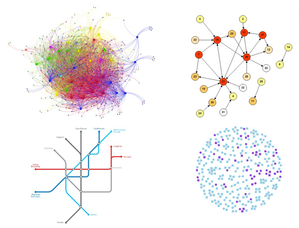
- The image to the right is one social network identified within the client’s business and has several interesting features:
- It is one month’s data from one department.
- Circles represent people, these are called Vertices in SNA speak.
- Circle colour reflects HiPo status, where blue is High Potential.
- Lines reflect total collaboration time, that is emails plus meetings. Thicker lines means more collaboration. These are called Edges to those whom dream in SNA.
- This is actually a select group of people who collaborated with every senior leader in this department that month.
- This image showcases the exploratory nature of SNA, that is the researcher needs to have questions in their mind they can then ‘test’ on the data. Here one theory was that there could be a link between being ‘well networked’ with senior leaders could be associated with being a High Potential (HiPo). This theory appears promising as close to 50% of people in this network are HiPo, as compared to 30% across the department as a whole.
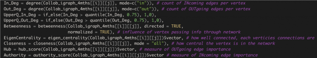
- As previously mentioned, there are a few individual metrics that can be pulled from a SNA.
- The above is a geeky code extract from the R programming language. Don’t worry about the all the funny symbols, instead the comments after the ‘#’ will explain the key ones.
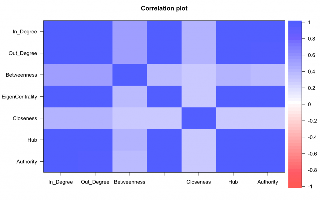
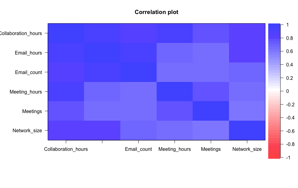
- Whilst there are a few metrics of interest, these turn out to be quite correlated to one another. Said differently, if a person is high on one of these metrics, then they are likely to be high on other metrics too.
- This is show in the image to the right, which uses colour to show the strength of the correlation between the SNA metrics – the darker the blue, the stronger the correlation.
The Dataset
- Four departments’ email and meeting data (keeping in mind no email nor meeting subject line nor content was included) across a four-month period. This equated to five million rows of data.
- Typically SNA is run across a complete network, i.e. a person in Department A could email or meet with potentially anyone in or outside the client organisation. However as only data from these four departments were available, the decision was made to ‘close’ each network at the department level. Said differently, only emails and meetings within Department A would be used in the SNA for Department A.
- The Edges or lines between people in the SNA can be created using a range of potential data sources. There were several available however they were highly correlated.
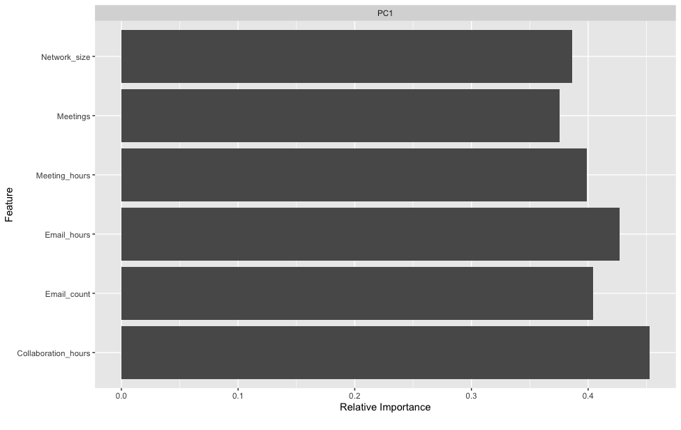
- The right-hand image above shows the result of a principal component analysis, which is just a supplement to the correlation plot. Here one component (a statistical summary of all these inputs) explained 70% of the total variance or information provided by these potential data sources. Said differently, even though on the surface there appears to be a wide choice of which data source(s) to use for the SNA, the reality was these sources were very similar.
- As a result, Collaboration Hours was selected as:
- It combines information from both emails and meetings.
- It had the strongest relationship with the principal component.
- Collaboration Hours between people is a product of emails sent (each email is worth four minutes collaboration) and meeting time shared. This simple calculation obviously comes at the expense of reality on several fronts:
- Not all emails are created equal, as we have all experienced, many take a lot longer than four minutes to respond to.
- The email data was not separable into a person who was on the TO field, as compared to the CC field. One could hypothesise that putting a person on the TO field signifies a stronger level of collaboration.
- Similarly, there was no indication of meeting size that people attended, hence it also seems logical to assume that the quality of collaboration between people would also be affected by meeting size.
- As this project was set up as a fast-fail style of experiment, the decision was made to focus on one business outcome of interest – High Potential (HiPo) status. This data was available for all people across all four departments and was off interest to senior leaders in the business. However, departments varied in both approach and level of objectivity in how they determined if an employee was labelled a HiPo or not.
The Approach
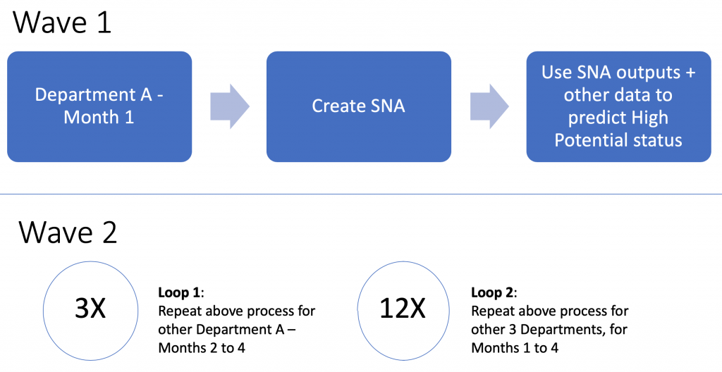
As Illustrated, the project has two distinct phases or waves:
- Wave 1 involved running the intended process from start to finish, that is extract the SNA metrics, combine these with other organisational data and feed them to a range of machine learning models to explore the relationship with High Potential status. A client progress check-in was held here to walk them through issues that might have emerged in the project, the intent behind the approach and early findings.
- Wave 2 replicated the Wave 1 process, a mere 15 more times…
Key Findings
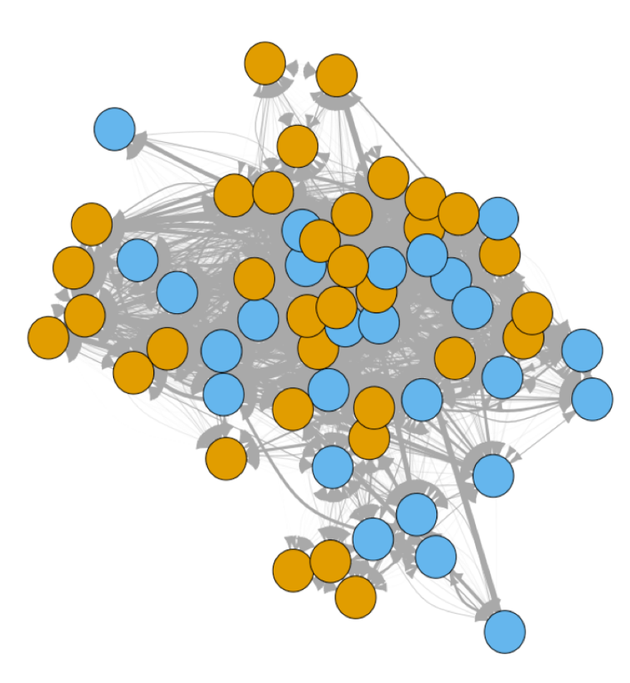
Communities
- One of the interesting findings that came from simply exploring the SNA graphs was the role of communities in predicting HiPo status.
- Communities are simply groups of people who are collaborating more closely than other people within a department. They are determined by a clustering algorithm, which simply looks for patterns in collaboration time.
- What was amazing about these communities is that they:
- Varied by month and department, that is Department A might have four communities emerge in Month 1 but six emerge in Month 2.
- Indicated a relationship with HiPo status, whereby disproportionately more HiPos could be found in one community group as compared to another.
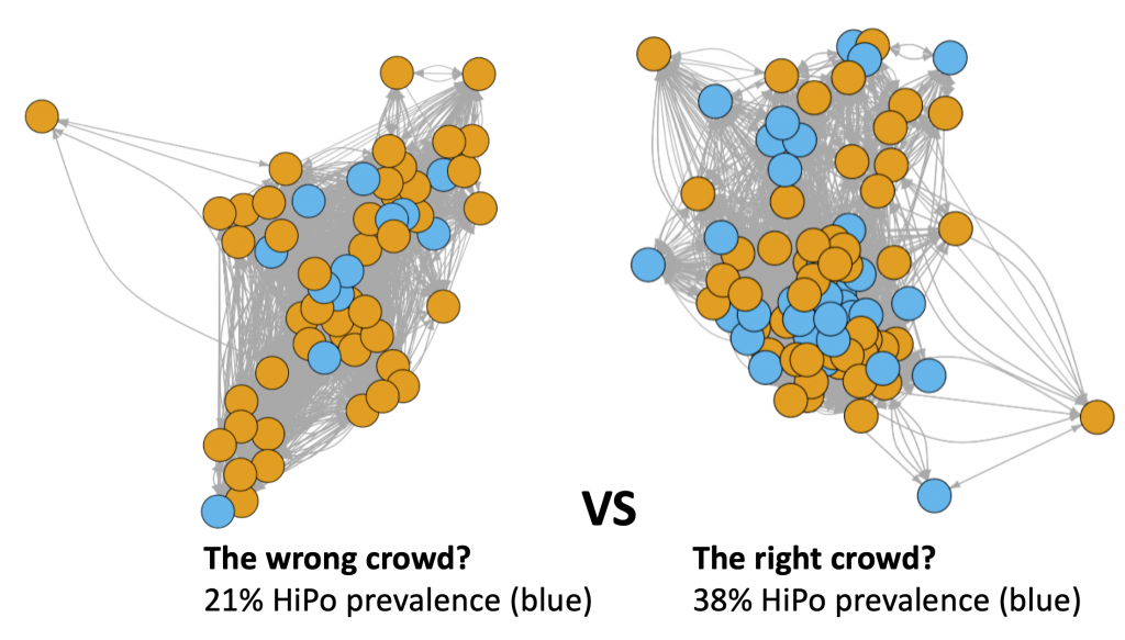
- The illustration above shows two communities from within the same department for one month. The HiPo base rate for this department is about 30% however being part of the ‘right’ or ‘wrong’ community can result in noticeably different HiPo rate, with about a 30% swing in either direction for these two communities.
- These illustrations also capture other interesting features, such as geographical location, as the people / circles / vertices in the right-hand community that stand out as being towards the edges, are located in either different cities or countries to the majority of the other people in this community.
- Using insights from these communities could be useful when considering social mobility or talent development initiatives such as mentoring, where potential mentor pools could be supplemented with community membership. That is mentors could be selected from those communities that are considered to be higher performing.
Model Performance
- A range of traditional and more modern statistical or machine learning models were used to explore the relationship between SNA outputs, plus other information (such as geographical location or job level) and HiPo status. All models were accessed from the Caret package in R.
- As is customary, the data for each department was split into a train and test sample, with the train sample being used to build the models across a variety of model specific hyper-parameters. Cross-validation was also used as a strategy to limit potential model overfit.
- Models were fit for each Department and each Month, so Department A would have four rounds of models (one per month) used to predict HiPo status.
- The test sample was used as a purer performance evaluation for each model, as this data was not used in any of the previous model building steps.
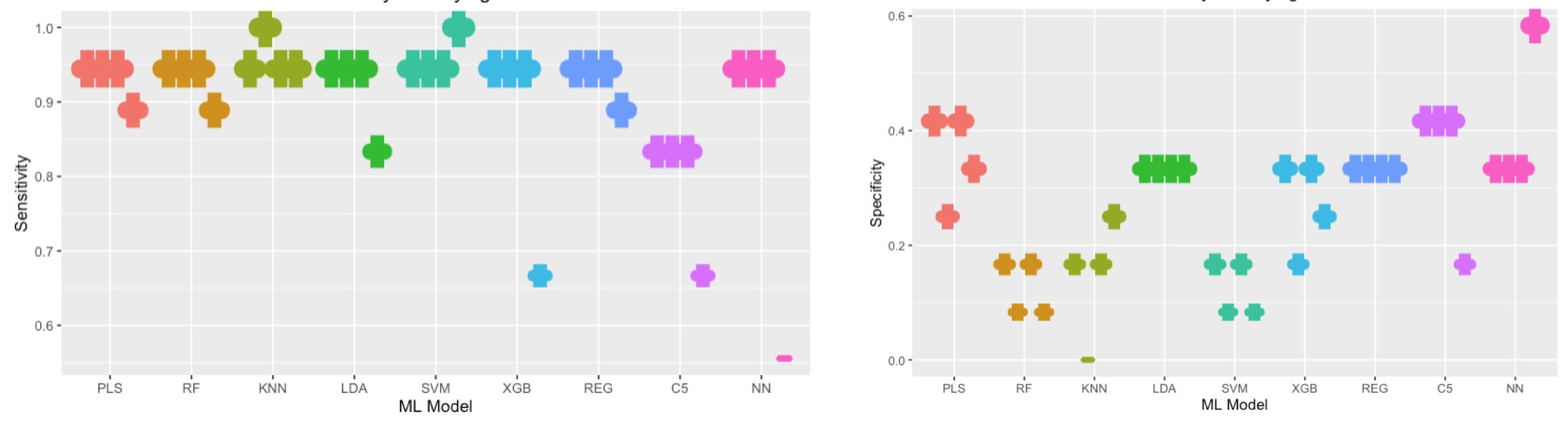
- These are some example outputs for one Department. The colour used maps to each model and each ‘notch’, represents a month.
- As the model was trying to predict two outcomes:
- Is this person a HiPo
- Is this person NOT a HiPo
- It can vary in it’s level of accuracy for each outcome
- The image on the left broadly shows that the models were quite consistent in achieving a high level of accuracy in correctly classifying a person as NOT a HiPo.
- The image in right shows that there was:
- Considerable variation in model performance in correctly classifying a person as a HiPo
- Lower accuracy overall across models in correctly classifying a person as a HiPo (note the change in the y-axis scale too)
- Looking across both images also illustrates the impact of which month’s model was used to make the prediction, as certain models showed large changes in performance from month-to-month. This reflects a separate analysis decision where potential predictors were filtered based on their relationship with the HiPo outcome, prior to modelling. This process shortlists the number of predictors used in the model, speeds up model computation time and typically has negligible impacts on overall model accuracy measures.
- This variation raises the interesting question should a model like this be used within a company, then the model’s predictors would need to be ‘fixed’ or stable for a certain period of time. The counterpoint is how often should these types of models be ‘re-trained’ or supplemented with more recent data. The community findings previously described showed that there are interesting and potentially important patterns emerging month-to-month that may need to be incorporated into models for their predictions to remain relevant.